Wednesday, August 19, 2015

Review of Strait Outta Compton


 Strait Outta Compton can be looked at in two ways. Here I see a film that is basically a musical biopic. It is about N.W.A. and how Eazy-E, Dr. Dre, MC Ren, DJ Yella, and Ice Cube got together and started a band. On the other hand, the film is also about the police state that exists in inner-cities all across America, and Compton is a key example.
In fact, the very first scene not only paints a portrait of Eazy-E’s life before the group started, but also the regularity of hyper-militarized police in South Central Los Angeles during the mid-to-late 1980’s. One could argue that this type of military action still exists today. With the exception that you will find local police departments in all types of neighborhoods with a tank/battering ram. SWAT-style vehicles, and paratrooper-style police officers. Even in my hometown of Roseville CA, you can find this type of police activity, and Roseville is not inner-city-nothing. It’s a suburban community where people come to shop and wealthy people buy homes.

At the center of this story is the group’s First Amendment right and the song “Fuck the Police.” Eazy-E even states, “the Government wrote that shit.” The scene where the Jerry Heller reads the threatening letter sent to the group by the FBI displays the fear the group installed into law enforcement on every level. In reality, “Fuck the Police” is just a song and it’s right to be performed by the group is fully supported by the United States Constitution. When the Detroit Police Department nearly started a riot and arrested the group after the band performed the track after being threatened by the police department shows the level of hypocrisy that exists in the country. That scene is something you would expect in North Korea, or maybe possible China. Not in America, where we are protected by the Freedom of Speech. Yet somehow it did happen.

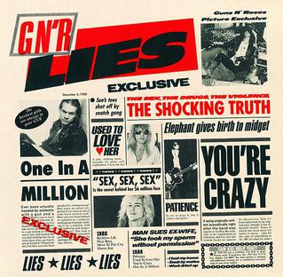
What happened to N.W.A. and the criticism they received for “Fuck the Police” was really nothing new. I do believe that it was because the group was “Gangsta” and they are black, that the criticism was out of fear. These types of responses to music happened frequently in the 1980’s and 1990’s. I remember Axle Rose catching flack for lyrics from the Guns n’ Roses album, GNR Lies­ with the track “One In A Million.” In fact, I recall buying tickets to go see Marilyn Manson during the “Antichrist Superstar Tour” only to find out a week before the concert that it was cancelled because several local religious groups pressured the Pan American Center in Las Cruces NM to shut it down. This was out of a direct result of fear and I have yet to see Marilyn Manson perform still. This was around the same time Tipper Gore introduced the Parental Advisory sticker on tapes and CDs making it difficult for people under 18 to buy music without their parent's permission. Luckily my mom was cool and thought that Parental Advisory sticker was bullshit and bought my music with me. 


Strait Outta Compton comes at a time when America is really starting to take a look at how their local police departments handle situations. The uprisings that have occurred in Oakland, Missouri, and elsewhere show that people are pissed off. The police are supposed to protect us. Not shoot at us out of fear. The police beatings we see popping up almost on a weekly basis are disgusting and un-called for. There is no reason for SWAT-style military vehicles sitting on-standby at the local police department’s yards. I don’t think criminals out there are carrying rocket launchers and tank-piercing bullets. Unfortunaetly, it doesn’t stop with the local PDs. When it was revealed that the NSA is indeed spying on Americans, a whole new threat to our daily lives as Americans emerged. In the movie theaters, “Fuck the Police” is what America needs to hear because law enforcement have been severly overstepping their bounds for too long. We need music and art like this to remind the law enforcement community to back off.  

Sunday, May 17, 2015

Deinterlace NTSC Video From FCPX in Motion 5


Recently, I had some footage come to me that was originally shot in DV NTSC 29.97 fps that I had to edit together in FCPX. When I exported the finished project in h.264, .mov, I noticed some real ugly video interlace artifacts. I think there may be a project setting that I am neglecting in FCPX, can somebody possibly clue me in?

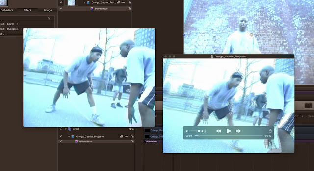
Two Quicktime windows showing the same paused video clip, one is from FCPX, the other after being deinterlaced in Motion 5. The program in the background is Apple Motion 5.
Deinterlace filter in Apple Motion 5.
Deinterlace filter in Motion 5.

The image above shows two Quicktime windows open showing the exact same clip in the same moment in time, paused. I opened both windows to compare the two. The Quicktime window on the right shows the original export from FCPX. The Quicktime window on the left shows the exported version from Motion 5 after I applied deinterlacing and changed the project settings as suggested by the Motion 5 help menu.

Change the field order to none in the Motion 5 Inspector.
Originally, I saw the deinterlace filter in Motion and thought, "great this should be real easy." Right? Just apply the filter and move on. Not so fast. I found in the Motion help menu that you need to change the field order to "none" in the project properties under the Inspector. I think the original Field Order setting is "Lower" or "Upper."

This was not obvious to me so I thought I should share this bit of information. Hope this helps anybody looking to deinterlace some NTSC video, especially when viewing on a computer monitor or HDTV with progressive video settings. If your footage was originally shot in 720p or 1080p, as is generally the case nowadays, then you don't have to worry about the ugly interlacing lines in your finished product.

Sunday, April 26, 2015

Vampire's Thirst


bloody mary with coming soon graphic over it

New short film I am working on called Vampire's Thirst about global warming, vampires, and drinks with mistaken identities. Wrapped shooting April 23rd on the Sacramento City College campus.

Blood Mixture by End of Days Brewing Company
Blood Mixture by End of Days Brewing Co. 
Thanks to Gimp Users for the blood splatter tutorial. I knew that GIMP sparkle brush was good for something. Made a cool beer bottle label inspired by the HBO show True Blood. See how it turned out in the image of Blood Mixture by End of Days Brewing Company. (I am sticking with that name for all my future homebrew endevors btw).

Scarecrow fangs from Amazon.com
I bought some cool fangs from Amazon.com that fit perfectly for the vampire. The night prior to shooting, I met with my lead actor (the vampire) and gave him the fangs. Wouldn't you know it, he called out sick. So I had to drive to his house that morning to pick up the fangs and give them to my backup. (In filmmaking, always have a backup). The fangs look great I would buy them again. They even came in cool carrying cases. They don't adhere to your tooth but come with a molding agent. Once fitted, you can use them over and over again.

Film props
Film props
Overall I think I spent about $150 dollars on this film. It was a school project so can't expect much. I had to buy all the props for the drinkers such as everything for a bloody mary. At least now I have plenty of vodka to go around. Should have the video edited and complete with special effects in about two weeks. Go to http://www.vampires-thirst.com.

Friday, November 14, 2014

Browsing For Web Design Inspiration

Just for some ideas, I like to browse around to see what other's have done with creating web sites for particular topics. I may start working on a new website with a musician and I am searching for inspiration. Fortunately, I follow a number of independent music acts on Twitter. So it was real easy for me to find good sites for examples. 
From what I could see right away, most of the artists use Bandcamp or Soundcloud as their main web presence for their music. I think that is good. Others just use Facebook which I don't like. You can upload videos and links but FB does not seem very well geared for music. Plus people get easily distracted on FB so your message or product will get lost.

Others use Wordpress or some other blogging platform. What is great about Wordpress is that you can incorporate themes and it seems pretty easy to use. Originally, I thought about using Wordpress to create my own blog but as you can see, I went with Blogger. Wordpress is good for those who are not web developers because you can update your content without having to contact someone such as myself for help, an another web developer, or having to learn web coding languages to update yourself. I think a Wordpress site would be a good way to go but I still need to research how Wordpress would treat audio files. Here are some examples of some musician's Wordpress sites I looked at:

http://benmyersonline.com/  <-- I don't like this site but it's functional.

http://www.evertheory.com/ <-- I like this one but I think you should see the music for listening to right away on the home page.
A few other artists use a good old fashioned website without the additional blogging interface. Here's some that I like:

http://www.empathytestmusic.com/ <-- I like this site because the music is right on the homepage. Plus it looks like the music is hosted on Bandcamp's server so that saves money with web hosting (which is usually pretty cheap anyways). However I have no clue how they coded it because all I see is a bunch of JavaScript and very little HTML and CSS. But I could do something similar.

http://seasonofghosts.com/ <-- This is a really nice website. Very well put together but it seems really big.

I am still waiting for feedback on this web design, so we shall see.

Thursday, November 6, 2014

Metallica on Weeklong for Craig Ferguson's Last Stand


These days, I don’t care about Metallica or The Late Late Show with Craig Ferguson and the host's departure (well maybe I do a little). Back when I worked nights, I used to watch all late night talk shows. Nowadays I am in bed before the 11 o’clock news so I don’t watch The Late Show, The Tonight Show, much less The Late Late Show.

Come to think of it... I don't watch much TV in my spare time, seeing that I work in television I guess I am sick of it by the end of the day. However, when I read in The Hollywood Reporter that Metallica will be doing a weeklong stint to help send Craig Ferguson off, I quickly imagined what songs they would play for each of the five nights.

To start off with, I thought it would be badass if Metallica set the mood with the downright heavy as hell, “One.” Shit it’s a Monday night, we’re in the mood for something dark with a touch of speed metal.


"One" is a bit of a throwback so Tuesday night Metallica should play something the tweens in the audience are aware of. Maybe “Fuel” will do the trick. Plus “Fuel” is a slamming mosh pit track and who doesn’t like that?


Wednesday Night, I would go with “King Nothing.” The blood and cum CD cover for Load, from which “King Nothing” was released is fitting for the Humpday theme.


Thursday is the descent into the weekend and Craig Ferguson's last few episodes as host of the Late Late Show. For this night we go baaaaaccckkk. Way back. To say ….And Justice for All. “Harvester of Sarrow” fits in nice here and is under-appreciated in the Metallica catalog.


For the Friday, the final night of the weeklong Metallica stint, it’s a toss-up. A choice the band should make 5 minutes before they go on stage. But my toss-up vote would go to “And Nothing Else Matters” or “Unforgiven.”

Again it’s a toss-up. What tracks would you choose? We’ll see what the band actually plays, starting November 17th late night on CBS.


Friday, October 31, 2014

Another Update to My Website

Homepage with slideshow, crumpled-ripped paper.
Super Busy! Despite all that I have going on, I managed to update my website yet again. After the last update, I was not content with the homepage, footer, about page, and wanted a slideshow. So I did those things, go check it out: http://gabrielohhmedia.com/.

The homepage needed to show off my graphic art skills and I thought it would be really cool to have some crumpled/torn up paper with text on it. First, I tried making a graphic with regular HTML paragraphs superimposed on the graphic. I hard a hard time with that so I included the text on the graphic itself. I made the crumpled up torn paper in The GIMP. Love The GIMP! I used a tutorial you can find here.

In addition, the homepage needed a slideshow, because nowadays, every homepage has a slideshow. To accomplish this, I borrowed a bit of JavaScript from a class I had last May. I just replaced the pictures and tweaked some of the timing. Worked out great. I did find that the images where taking a long time to load so I had to resize the pictures in The GIMP. Again, love GIMP!

I felt that the footer was really boring. I see footers on websites that are cooler than the content of the main article. So I wanted to spruce up my footer. Fresh out of ideas I figured I could use my header graphic, which is just a picture of me, Warholized. I flipped in the image and added some gradient. Nice.

Unintentionally, I changed the font. I wanted a different font for the crumpled up paper on the homepage. Like typewriter style. As I mentioned earlier, I wanted to superimpose my HTML text over the graphic, so I changed the article fonts to monospace. This changed the font to monospace on every page so I decided to stick with it. Plus monospace is available on every computer, making it easy on the download.

The about page, the page that explains me, is still needing some work. Maybe another picture of me somewhere. I added a gradient to the article content so as you read down to the bottom, the colors get darker. Well work on that later.


Monday, October 20, 2014

Updated Website

new web page
The New Web Page Showing My Web Work
Took some time today to update my website. I added a page to show off my web development and design work. Go take a look, then hire me :)

My plans for later include re-coding the graphics galleries in the graphics page, but I think I am OK with how it looks for now. By re-coding, I mean incorporating a picture gallery from jQuery. Something that can replace some of the CSS3 visibility and hovers that I am using.

Luckily, the most recent Firefox update seemed to fix some of the CSS3-related errors I was seeing in that browser only. The errors I was experiencing were coming from the visibility property and hover selector used in the stylesheet. The errors where making some of the images huge and popup off screen when the user hovered over the image. Again, this occurred in Firefox only. Now everything seems fine. However, I will have to try the graphics page in other browsers later.